By Nico Saieh — via:archdialy
© Dan Brunn
 W
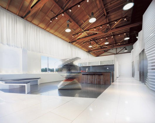
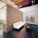
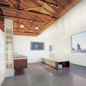
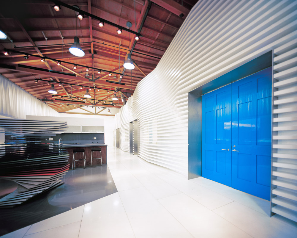
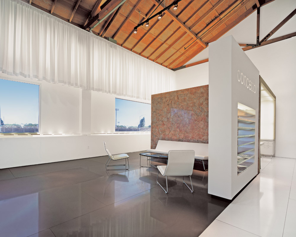
Working with an existing warehouse shell, one of the key design objectives was the integration of the old with the new; creating a synergistic juxtaposition between the raw existing space and the new pristine space. To accomplish this, a careful orchestration of elements is placed within the confines of the existing shell. These new elements enhance and work with the existing conditions. The new elements ultimately respect and enhance the otherwise banal shell.
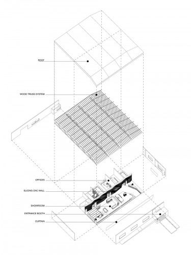
exploded axo
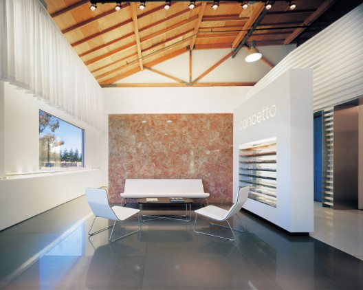
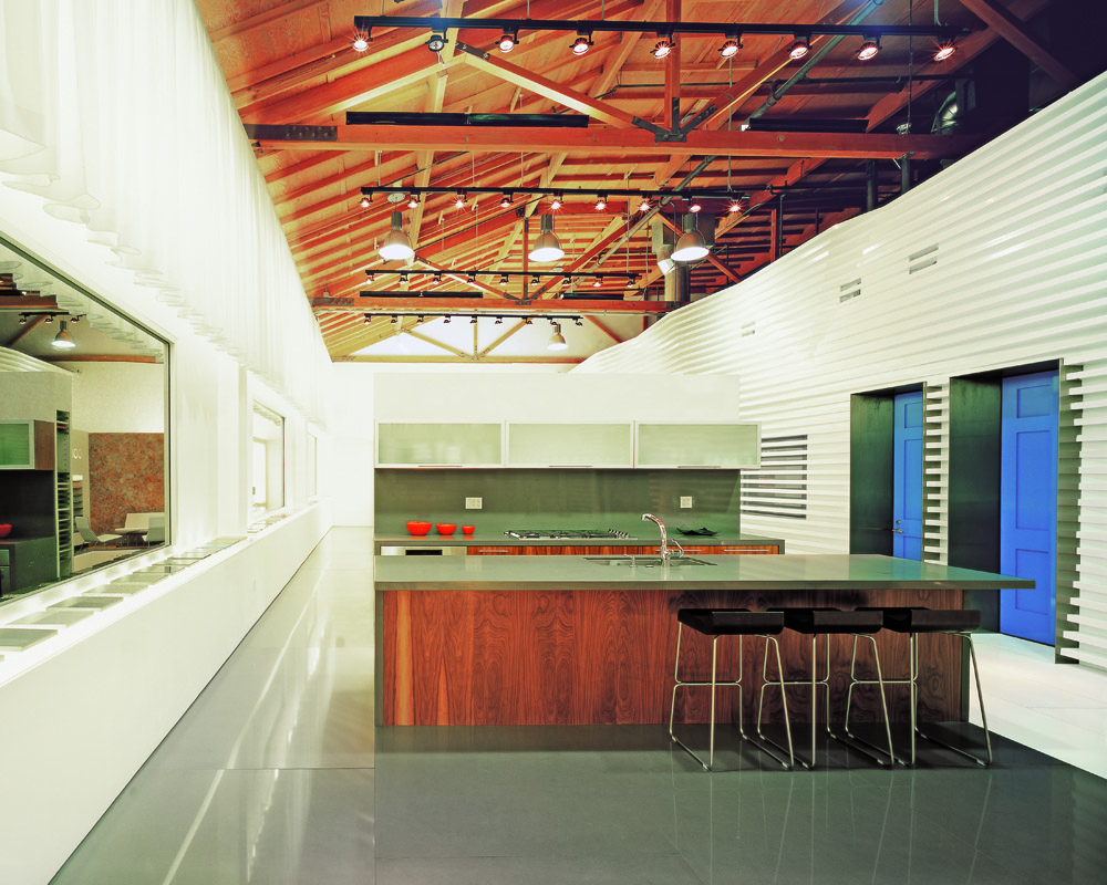
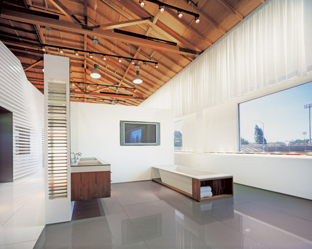
he existing shell was sandblasted to reveal the warmth of the wood trusses underneath the layers of paint and dirt. Using the existing windows and structure as a reference, the organization of showroom spaces follows their rhythm, thus creating a free flow of pavilions that are naturally lit by the large windows.
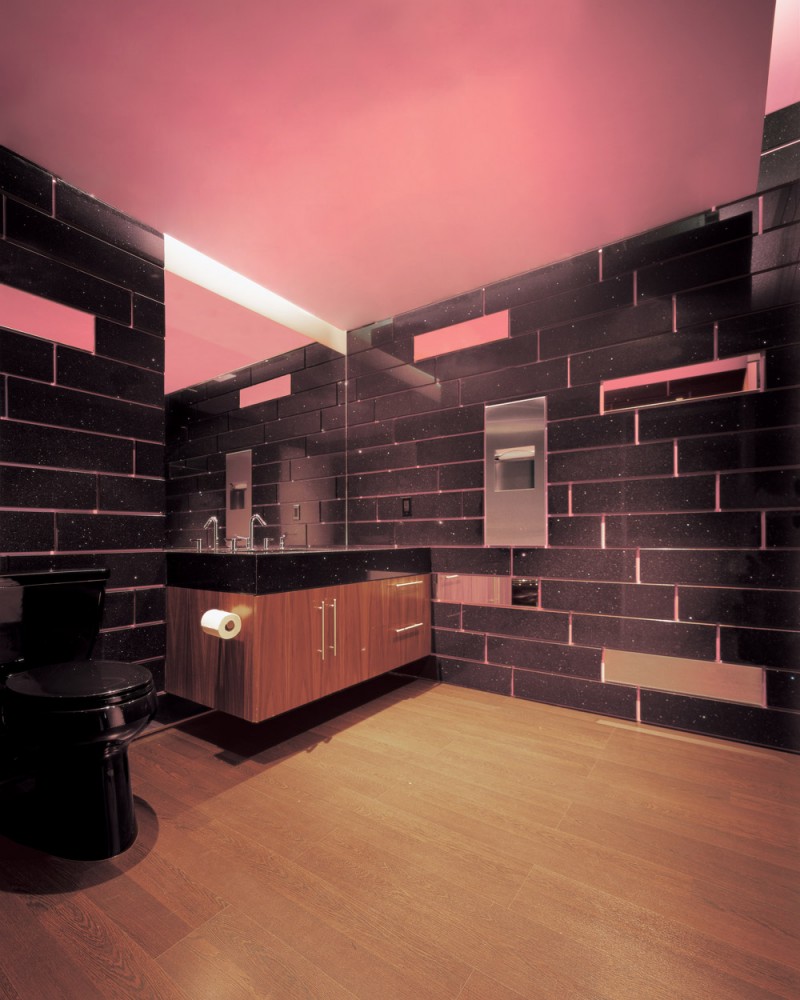
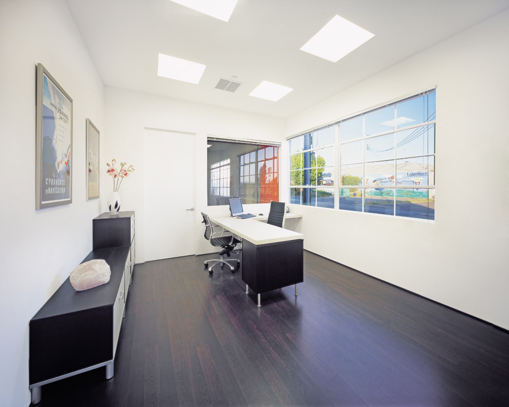
In plan, the space is divided into two parts along its longitudinally: public and private. A natural clarity for showroom visitors and employees is achieved. On one side is the new open plan showroom with natural light (existing windows) and on the other are the administrative staff offices and services (toilets, storage, IT room, staff kitchen) located in relation to the storage warehouse beyond.
© Dan Brunn
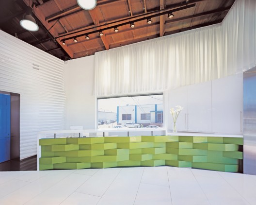
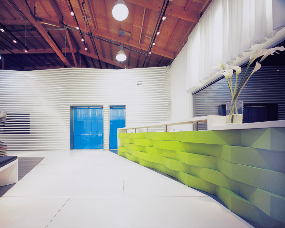
eginning at the entry space, a custom receptionist desk is easily recognizable to new customers. The receptionist desk was designed as an inspirational piece as to how the product being featured, CaesarStone, could be used in a multitude of revolutionary methods beyond the counter top. Featuring Apple Martini CaesarStone, horizontal bands of undulating shapes create the monolithic yet light and airy desk. The design motive is in relation to the main architectural feature of the space: the separation CNC Fin Wall.
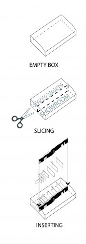
diagram
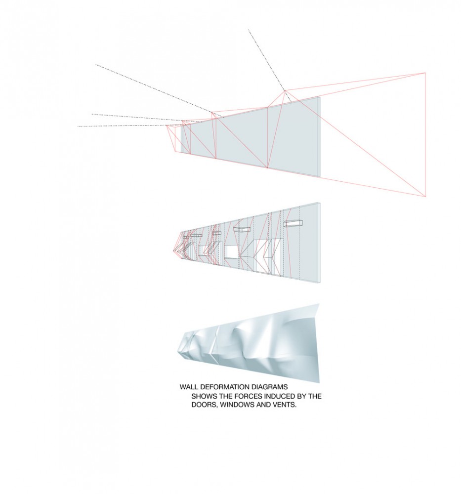
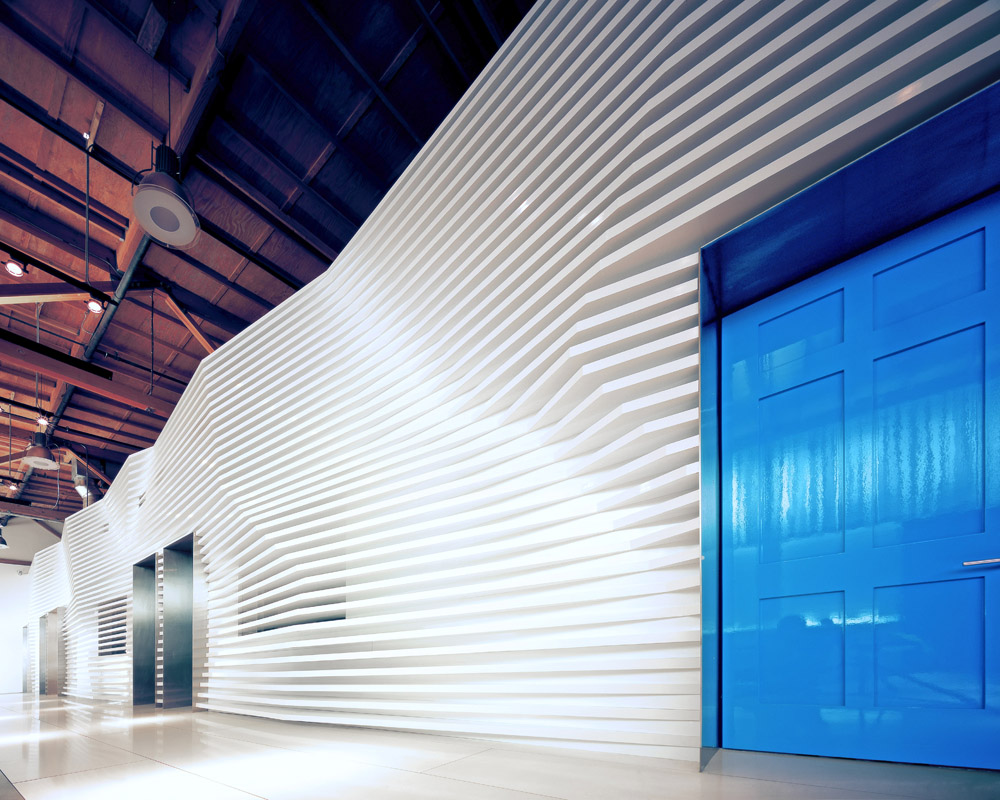
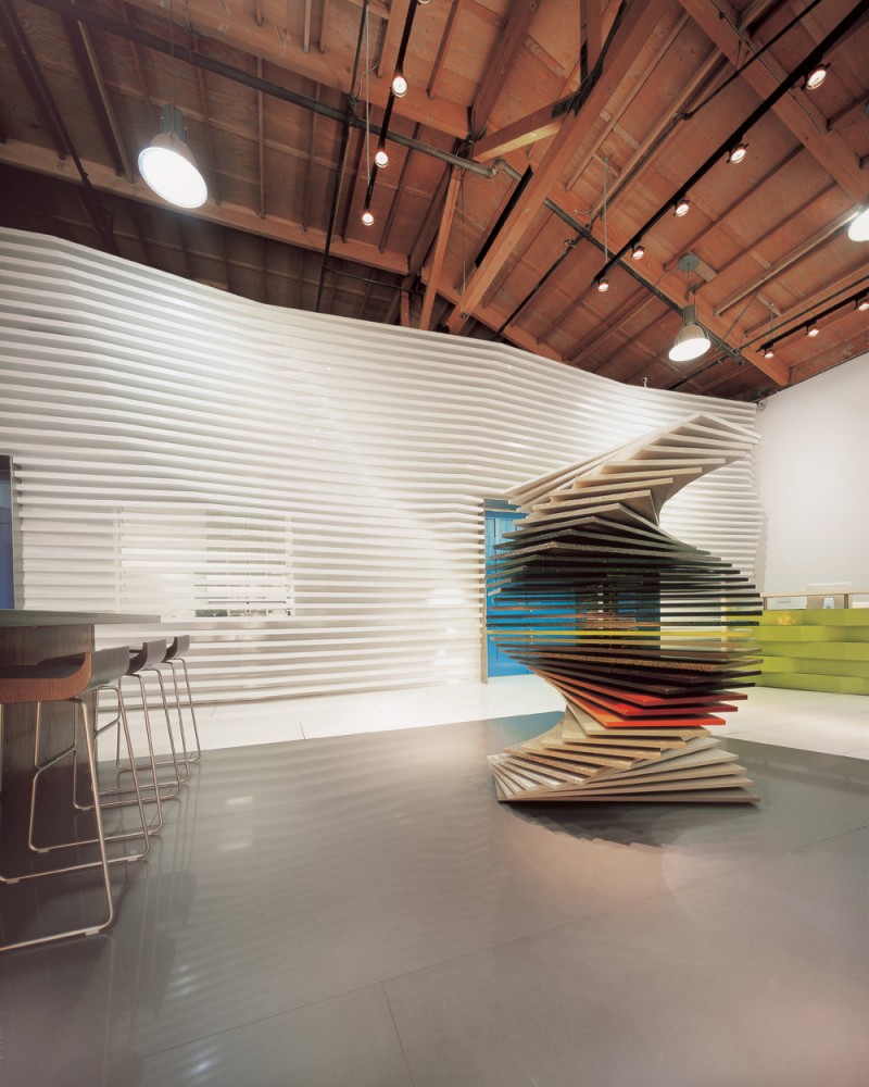
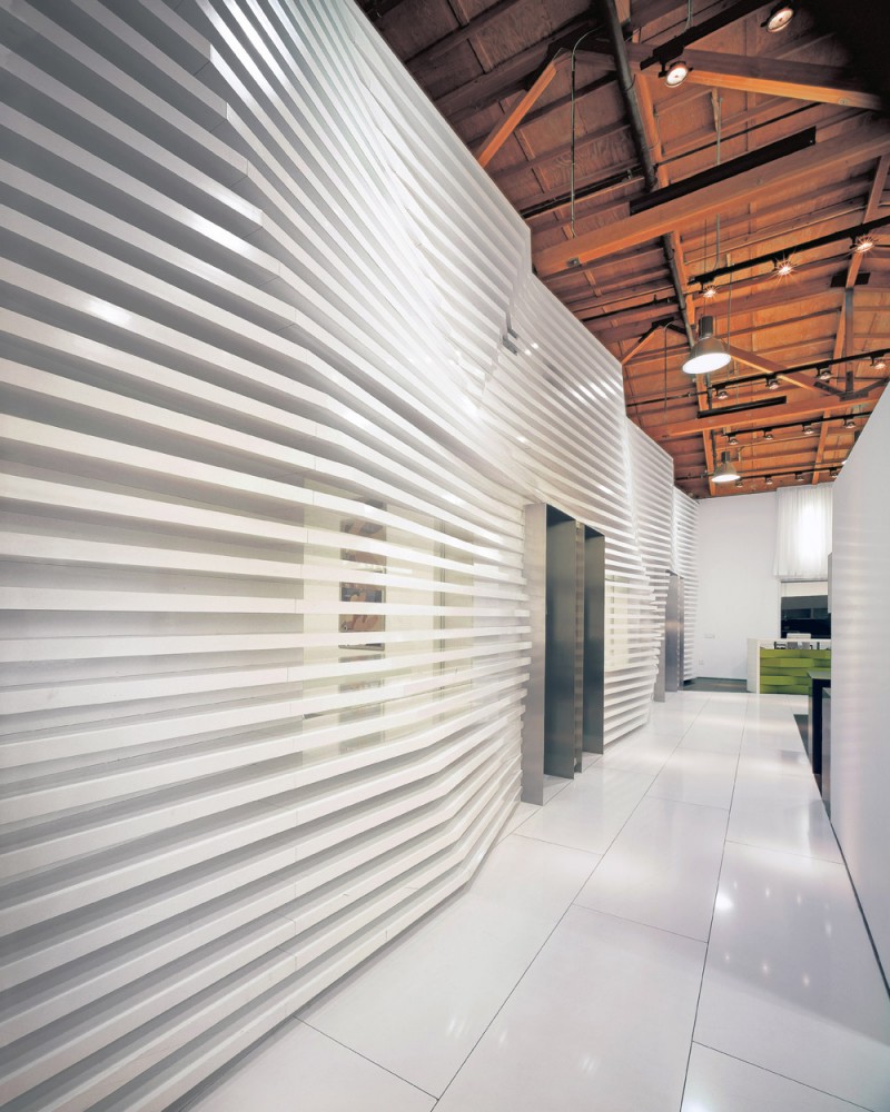
he separation wall delineates between the two major two spaces / function (public and private). It is a very strong aspect of the design; measuring roughly 120′ long and 15′ tall. The wall’s proportions render it a very large and imposing mass. However, a solution to this problem becomes the showroom’s main feature. If one is to familiarize oneself with the methods in which stone is cut at the quarry, one recognizes the sharp serrated edges. If looked upon closely, these edges resemble a mountain range. The wall exploits this raw stone look, since the product being sold is, after all, a quartz-based product. The abstraction is accomplished by creating a screen of 2″ thick plastic laminated wood fins. Each of the fins is custom-cut to replicate the peaks and serrated edges of the stone using a CNC router. There are 37 of these pieces starting from the bottom of the 15′ tall wall and going across 120′ in length. The resultant feature is a sinuous and dynamic effect that is best experienced by walking by the wall, or even touching to feel the peaks and valleys.
© Dan Brunn
eside the entry area is the Spinning Display. The client had wanted to display all the stone slabs on vertical leaves; however, as the showroom caters to design professionals, it was argued to break conventions and to display the stone in a horizontal position, as it is most commonly installed. By featuring the material in its familiar state, the display facilitates the appreciation of its surface qualities, including reflection and color. The problem arose as to how to display 40 unique colors within the space limitations. To display the material horizontally, 40 slabs, (4′-0″ x 1′-6″) are stacked one atop another, with a thrust ball bearing in between to allow free rotational motion. Designers can approach this kinetic sculpture and rotate to reveal their choice, or just play and make a new sculptural gesture. At each visit to the showroom, this sculptural piece would take on a shape of its own.
© Dan Brunn
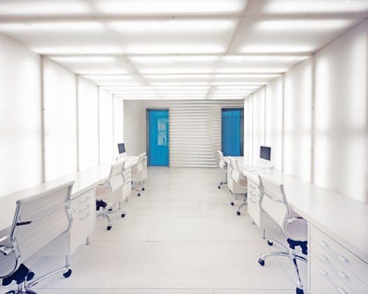
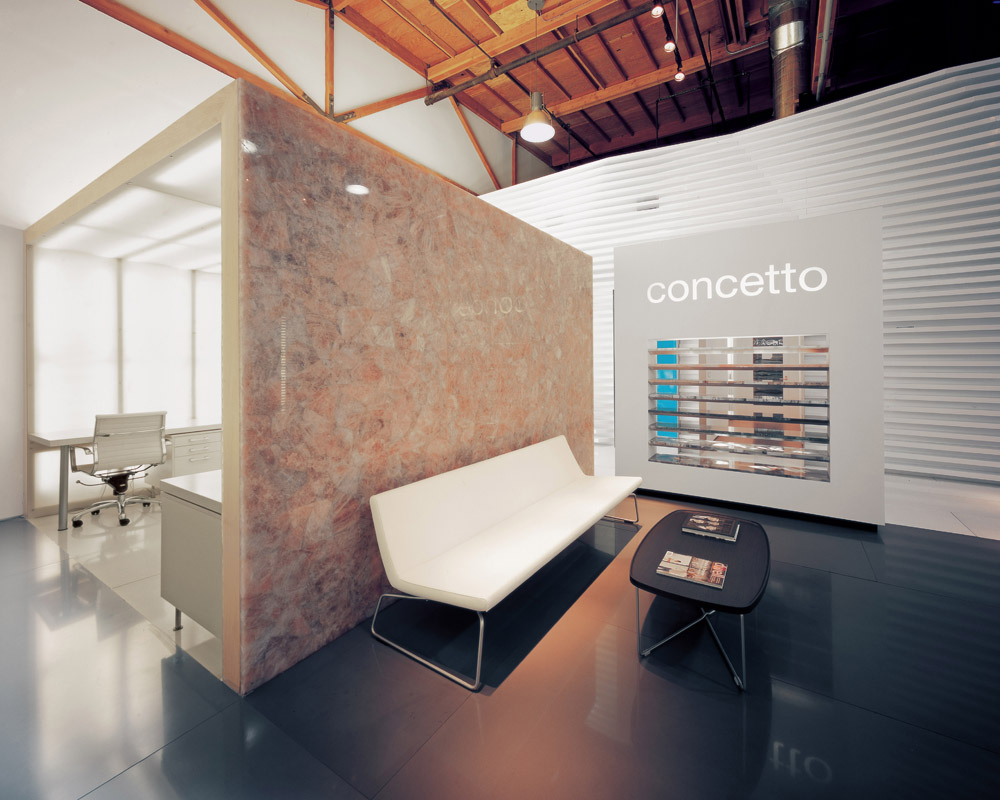
owards the end of the long space is the Sales Area. Designed to accommodate the needs of the sales staff that typically arrive to the showroom part day to work at a desk with their laptops and meet with clients. The area is delineated as a semi-private space, within a tunnel-like space. Lumicor laminated plastic sheeting is clad over furniture grade lumber framing and backlit with fluorescent fixtures. The sales staff offers a unique and comfortable setting for clients and staff.
© Dan Brunn
© Dan Brunn
© Dan Brunn
© Dan Brunn
© Dan Brunn
© Dan Brunn
© Dan Brunn
© Dan Brunn
© Dan Brunn
© Dan Brunn
© Dan Brunn
© Dan Brunn
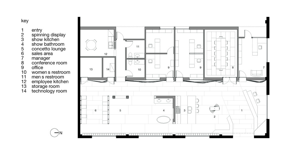 floor plan
 sectional perspective
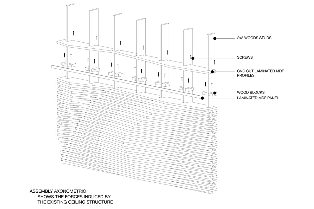 assembly axo
 wall deformation diagrams




 floor plan
 sectional perspective
 assembly axo