Post By:Kitticoon Poopong
via:archrecord--By Ingrid Spencer
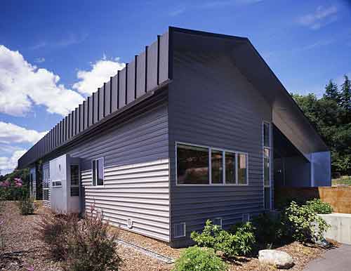
Photo © Matthew Millman
Who wouldn’t want a house in the California wine country, especially one designed specifically for you? Mark Horton, principal of San Francisco-based Mark Horton Architecture, made that dream come true—twice—for his own mother, Yvonne. “The first home I designed for my parents was much bigger, on a vineyard, and fit their lifestyle at the time,” he says. See that house at www.mh-a.com/architecture/residential/healdsburg_I/. While Horton’s parents loved the house, things have changed, and with his 80-year-old mother now on her own, she needed to be closer to amenities, and live on one level.
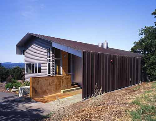
Photo © Matthew Millman
Located on the far end of Healdsburg, on a hill overlooking the town, the 1,800-square foot three-bedroom, two-bathroom house is both simple and practical. “My mother wanted a ‘no maintenance’ home,” says Horton, “and while some maintenance is always required, I wanted to give her as easy a home to take care of as possible. The structure and materials of this house adhere to that idea.” 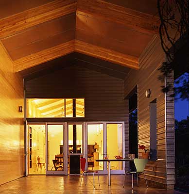
Photo © Matthew Millman
A gutterless, pitched metal roof starts at the ground on the house’s north side. The four-sided roof plane is extruded in the east/west direction, forming a protective cover for the rectangular volume within. Exterior materials include metal siding, both flat and horizontally ribbed; concrete flooring for the covered patio; aluminum windows; and the one material that isn’t completely maintenance free, knotty pine cladding. Inside, the knotty pine continues, covering a wall containing storage and cabinets that travels the length of the house, dividing the public and private spaces. The basic plan is two long rectangles that shift off of each other, with the public areas located in one open volume. “We chose the pine because it’s not a sophisticated material, yet it provides such a juxtaposition with the machined metal on the exterior,” says Horton. The ceiling is also clad in pine, with bamboo flooring and cherry wood cabinets completing the simple, warm interior finishes. 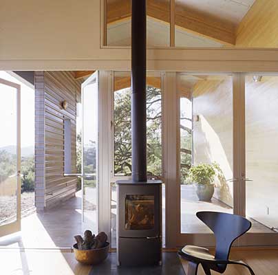
Photo © Matthew Millman
While it was important that the program dispense with multiple levels and steps, Horton found ways to vary the design elements, so the house didn’t become a static object. He used different kinds of glass in the windows, including a horizontally striated glass in the kitchen (“It looks like carbonated water,” he says), and added a red-glass window in a reading nook off the dining room. “That reading nook has a long horizontal window at waist level,” says Horton, “so you can perfectly see the hills when you’re sitting at the dining table. The little red window was a folly, really. It reminds me of wine, and the sun coming through it adds interesting color to the house.” Also adding an interesting flavor to the home are the three large globe lighting fixtures that hover above the dining table and light the large open volume. “I saw them as large clouds in that big space,” says Horton. 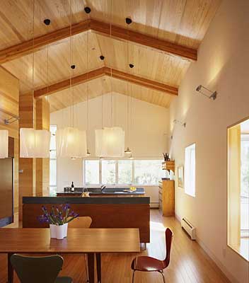
Photo © Matthew Millman
The house is well suited to Yvonne Horton, who’s not your typical 80-year-old—you’ll find no doilies in this house, she still works as a real-estate broker, tends her garden and four beehives, and leads an active life. “We all progress, or regress, you might say, at some point in life,” she says. “This home is perfect for my needs. Sunset is my favorite time in the house. I watch the sun go down below the hills and know that this life, and this house, fits me well.” 
Photo © Matthew Millman

Site Plan
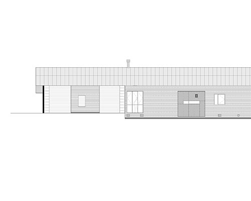
Elevtion
