London, England
SHH
Post By:Kitticoon Poopong
 |
| Photo © Courtesy of Francesca Yorke |
London-based architects and
interior designers SHH have created a new fascia and interior design treatment for
Apostrophe at the operator’s latest outlet in London’s
High Holborn – the 16th in the group to date. See more images and architect’s description after the break.
 |
| Photo © Courtesy of Francesca Yorke |
 |
| Photo © Courtesy of Francesca Yorke |
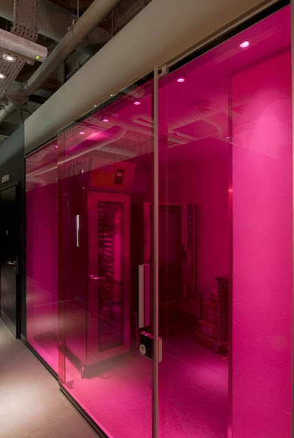
Briefed to move the brand on by utilising lessons learnt from previous outlets, the design for the High Holborn branch features adaptations of the classic black, pink and walnut brand palette, as well as new materials and features, including a pink-screened baking area, which underlines product transparency by opening up the baking process to customers; elements of bespoke furniture; grey ceramic ‘Royal Mosa’ tiling and the Bourellec Brothers’ ‘Clouds’ wall hanging, used in two of the café’s seating zones.
 |
| Photo © Courtesy of Francesca Yorke |
The existing 155 sq m site for the new outlet was an empty shell, created as part of a series of upgraded retail units within an overall building refurbishment scheme. In spite of a great location with plenty of footfall from local offices, the site was challenging as it was long and narrow, so that all operational issues had to be carefully considered by the operator, together with the
SHH team. A planning application for the signage and fascia treatment also had to be submitted to and was subsequently accepted by
Camden Council.
 |
| Photo © Courtesy of Francesca Yorke |
 |
| Photo © Courtesy of Francesca Yorke |
The solution for the site involved a careful division between operational and customer areas in order to avoid constriction in the narrower rear zone. Several seating zones were created, each with a unique feel and furnishing arrangement. In addition, the space was broken up into operational areas for both ‘grab and go’ and assisted service, as well as the wash-up zone, food prep and bakery area. ‘Much of our client’s business involves customers consuming food and drink on site rather than to take away,’ commented project head Brendan Heath from SHH. ‘Unlike many other operators who rely on a rush of grab & go take-away business, Apostrophe seeks to attract customers to its stores throughout the day by offering free
WiFi and complimentary newspapers, as well as playing carefully-selected background music. The aim is to have a busy but relaxed and inviting ambience, where people genuinely feel at ease and are happy to spend time.’
 |
| Photo © Courtesy of Francesca Yorke |
 |
| Photo © Courtesy of Francesca Yorke |
The new shopfront has been given an architectural treatment with a strong geometric feel. Fascia and projected signage were both needed to give the narrow site as much visibility as possible. The main sign is in black with an overlaid pink brand sign with text in white and black, along with Apostrophe’s tagline – ‘the accent is on taste’ – in white. The projecting sign is a square pink box with a halo-illuminated ‘o’ taken from the apostrophe logo and acting as a shorthand marque. The overall shopfront frame is in black powder-coated aluminium, whilst a central shopfront column is clad in walnut veneer to reference the generic brand palette. Glazing is full-height so that the first ‘lounge’ seating area to the right of the entrance becomes a living advert for the brand and interior. At the left side of the glazing, the first ‘assisted service’ display case is prominent and highly visible to passers-by.
 |
| Photo © Courtesy of Francesca Yorke |
 |
| Photo © Courtesy of Francesca Yorke |
Flooring in the lounge area and throughout is a grey ceramic tile by Royal Mosa. Furniture in this area is freestanding: the Tab chair (from Bulo) with a walnut shell and black vinyl seat. ‘This is the first time this chair has been used in an Apostrophe scheme’, explained Brendan Heath. ‘It’s a great-looking chair with a ledge at the back which really encourages customers to sit back and relax.’ The tables here have a standard base with a solid walnut top created by the main contractor on the scheme, Barnwood.
 |
| Photo © Courtesy of Francesca Yorke |
 |
| Photo © Courtesy of Francesca Yorke |
Also visible from the exterior in the lounge area is the Bourellec Brothers’ ‘Clouds’ decorative wall tiles, configured by SHH to run up the wall and to wrap over the ceiling. The wall hanging system by Kvadrat (distributed by Ligne Roset) is in a colourway, which fitted perfectly into the scheme. It also serves as a good sound-absorber because of the faceted surfaces of the individual components.
 |
| Photo © Courtesy of Francesca Yorke |
The two counter areas, for assisted service and ‘grab and go’ are both bespoke to Apostrophe and not just standard chill displays. The chilled areas are made out of stainless steel with UV-bonded glass in order to minimise visual structure and maximise the display of products. The new 1.6m high ‘grab and go’ 1.6m unit, Apostrophe’s first, was a specially-engineered solution by EMH International.
 |
| Photo © Courtesy of Francesca Yorke |
The walls throughout are either in American black walnut panelling or black laminate with a high datum level and dark grey paint up to the ceiling, where services are left exposed and original remains of plaster cornices are also simply painted grey. ‘We were fortunate enough with this particular shell to have some interesting features at that height’ commented Brendan Heath ‘ and so there was no need for a low ceiling to block out services and we could maximise the feeling of space, with the ceiling as high as 3.6m in places.’
 |
| Photo © Courtesy of Francesca Yorke |
 |
| Photo © Courtesy of Francesca Yorke |
Beyond the main counter on the left is a wash-up area in the form of a freestanding ‘box’, which uses the main colours of the branding by having a black laminate exterior and glossy pink laminate interior. The outside wall of the wash-up area is used to support a long, walnut-clad eating ledge (an architectural extension of the counters), with a number of freestanding seats (small stools by Barcelona Design).
 |
| Photo © Courtesy of Francesca Yorke |
 |
| Photo © Courtesy of Francesca Yorke |
The central zone (and potential compression point of the site) houses further banquette seating, upholstered in black, as well as more freestanding seating, with feature lighting above (pendants by Aarevelo). Deeper into the unit , in front of the bakery area, is a large, freestanding solid walnut meeting table (designed by SHH) , which can seat up to eight people and is there to encourage ‘breakout’ meetings from local offices, as well as to break up the zones as a feature area. Behind the table, this time against a bright white wall panel, is the second use of the ‘Cloud’ wall tiles, in a slightly smaller formation. The area is also bordered by a set of newspaper slots lined in gloss pink Chameleon from Altro and set into the walnut wall at one end. At the far end of the wall is one of the scheme’s major design features: the pink glass bakery area (using a glazing system by Bene with transparent pink film).
 |
| Photo © Courtesy of Francesca Yorke |
 |
| Photo © Courtesy of Francesca Yorke |
 |
| Photo © Courtesy of Francesca Yorke |
 |
| Photo © Courtesy of Francesca Yorke |
 |
| Photo © Courtesy of Francesca Yorke |
The people
Architects: SHH
Location: London, England
Design Team: Neil Hogan, Brendan Heath, Adam Woodward
Photographs: Francesca Yorke
via:archdaily


