221 Heuk seok-dong, Dongjak-gu, Seoul, South Korea
Kim In Cheurl
Post By:Kitticoon
 |
| Photo © Courtesy of Park Young Chea |
CAU Central Library: Overlap is a refurbishment project designed by Kim in-cheurl+archium. It was restructured on the existing library which was built in 1959.
"Architecture is an identification of place, a creation of individualism that makes it unique to anything else in the world. The place thus creates a memory with time.
The meaning of place is the result of an accumulation of memories."
 |
| Photo © Courtesy of Park Young Chea |

CAU Central Library: Overlap
Architecture is an identification of place, a creation of individualism that makes it unique to anything else in the world. The place thus creates a memory with time.
The meaning of place is the result of an accumulation of memories.

 |
| Photo © Courtesy of Park Young Chea |
 |
| Photo © Courtesy of Park Young Chea |
The Vestige
The existing library was designed in 1955 and completed in 1959 (50 years ago) by Cha Kyung-soon (1916 – 1974) a senior architect. He had already been related to
Chung-ang University with the design of the pharmacy colleges (Phyper Hall) in 1953.
 |
| Photo © Courtesy of Park Young Chea |
 |
| Photo © Courtesy of Park Young Chea |
The horizontal mass from B1 to 3rd floor and the 7th story tower carry monumentality and architectural symbolism. The shape which is divided by the structure and envelope emphasize the grid and compose the windows in a simplistic manner. It shows the formality which is faithful to the modernism of the past by making a central courtyard over a rectangular plan into the centre of the space. Interesting elements are materials and details which create the executed design. There were materials which are not being used and produced anymore and construction methods which are old in their fashion. Removing the existing ceiling to expose the concrete allowed the building to portray its time in texture when plywood was of short resource. I supposed they would blend in with the new ones if I have them function again instead of discarding them. An emblem of CAU (Chung Ang University) standing prominently as the library building was supposed to be torn down at first, but it should be regarded as a memory since it is a representation of the history.
 |
| Photo © Courtesy of Park Young Chea |
 |
| Photo © Courtesy of Park Young Chea |
 |
| Photo © Courtesy of Park Young Chea |
Light
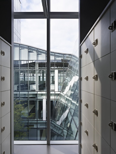
Reading rooms extended to the rooftop make the space which is opened on roofs of curved surface. A crevice from intersecting curved surfaces act as a skylight and enables natural light into the deepest spaces. It needs artificial lighting to get sufficient illumination at certain times of the day, but I tried to make the most of artificial light during daytime. On the facade I adjusted the density of white stripes printed on the glass so that an external glass wall intersected vertically and perpendicularly with the curved roof can absorb sunlight selectively according to the condition of all directions. Those stripes arranged by various widths secure the outside view, however they screen the inside if seeing outside like a blind. With an opinion of a foundation reserving the lacking space filling a vacant courtyard, it is divided in half diagonally and filled with bamboo so that it creates light wells and ventilates well.
 |
| Photo © Courtesy of Park Young Chea |
 |
| Photo © Courtesy of Park Young Chea |
The Place
I had to replace the trace of time and the momentum of remembrance with architectural work. An expansion of space and improvement of environmental overlap with memories of its past remain. I left the existing elements at the bottom and put the light space above so that one can easily be seen. Lower-level floors and a canopy above the entrance retain its original form, thereby it’s expected that a current picture is in collusion with time in the same context. The existing clock tower is used as a resting space in the library. A roof garden on the 5th floor and the tower on the 6th and 7th floors become an observatory viewing the Namsan Mountain beyond the Han river. The glass of the tower doesn’t have vertical prints like the bottom, to enable a spectacular view. Inner space is finished with gray tone so that it is simply the background for the books and students who read them. I expected this library to be a light box carrying sunlight by day and radiating it out by night.
 |
| Photo © Courtesy of Park Young Chea |
 |
| Photo © Courtesy of Park Young Chea |
 |
| Photo © Courtesy of Park Young Chea |
There could be a cultural change which used to be occupied with high heels and short skirts into sneakers and plain clothes. Its space can be filled with the atmosphere of archives in a monastery instead of splendour of a department store. It’s because the place has dominance from the suitable culture matched with it, that the place can be realized after it is created and refined and no longer be a vacant ground.
 |
| Photo © Courtesy of Park Young Chea |
 |
| Photo © Courtesy of Park Young Chea |
 |
| Photo © Courtesy of Park Young Chea |
 |
| Photo © Courtesy of Park Young Chea |
 |
| Photo © Courtesy of Park Young Chea |
 |
| Photo © Courtesy of Park Young Chea |
 |
| Photo © Courtesy of Park Young Chea |
 |
| Photo © Courtesy of Park Young Chea |
 |
| Photo © Courtesy of Park Young Chea |
 |
| Photo © Courtesy of Park Young Chea |
 |
| Photo © Courtesy of Park Young Chea |
 |
| site plan--drawing Courtesy of Kim In Cheurl |
 |
| 1F floor plan (new)--drawing Courtesy of Kim In Cheurl |
 |
| 1F floor plan (old)--drawing Courtesy of Kim In Cheurl |
 |
| 2F floor plan (new)--drawing Courtesy of Kim In Cheurl |
 |
| 2F floor plan (old)--drawing Courtesy of Kim In Cheurl |
 |
| 3F floor plan (new)--drawing Courtesy of Kim In Cheurl |
 |
| 3F floor plan (old)--drawing Courtesy of Kim In Cheurl |
 |
| 4F floor plan (new)--drawing Courtesy of Kim In Cheurl |
 |
| 4F floor plan (old)--drawing Courtesy of Kim In Cheurl |
 |
| 5F floor plan (new)--drawing Courtesy of Kim In Cheurl |
 |
| 6,7F floor plan (new)--drawing Courtesy of Kim In Cheurl |
 |
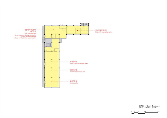
| B1F floor plan (new)--drawing Courtesy of Kim In Cheurl< |
 |
| B1F floor plan (old)--drawing Courtesy of Kim In Cheurl< |
 |
| north elevation (new)--drawing Courtesy of Kim In Cheurl |
 |
| north elevation (old)--drawing Courtesy of Kim In Cheurl |
 |
| west elevation (new)--drawing Courtesy of Kim In Cheurl |
 |
| west elevation (old)--drawing Courtesy of Kim In Cheurl |
 |
| section A (new)--drawing Courtesy of Kim In Cheurl |
 |
| section A (old)--drawing Courtesy of Kim In Cheurl |
 |
| section B (new)--drawing Courtesy of Kim In Cheurl |
 |
| section B (old)--drawing Courtesy of Kim In Cheurl |
 |
| diagram--drawing Courtesy of Kim In Cheurl |
 |
existing library--drawing Courtesy of Kim In Cheurl |
The people
Architect: Kim in-cheurl+archium
Designer: Jo joonyoung
Supervisor: Jo joonyoung, Chung Sangjoon
Design period: 09.2008~12.2008
Construction period: 12.2008~09.2009
Client: CHUNG-ANG UNIVERSITY
Photography: © Park Young Chea
Structure: RC+STEEL STRUCTURE
Outside finishing: THK24Low-E pair glass(printed)+THK0.8 VM ZINC
Inside finishing: THK3 ST panel & rubber tile
Structural engineer: SEN Structural engineers Co.,LTD
Mechanical engineer: ENG Energy Design Lab & Geuk dong electronic design lab
Sign design & engineer: Park sun-mi & Dasantech-group A
Construction work: DOOSAN Engineering & Construction Co.,Ltd+ Hanmok interior design
Location: 221 Heuk seok-dong, Dongjak-gu, Seoul, Korea
Site area: 174,891 m2
Floor area: 3,429.43 m2
Total floor area: 14,258.20 m2
Building to land ratio: 2.38 m2
Floor area ration: 9.42%
Building scope: B1, 7F


