Architect: Guilherme Machado Vaz
Client: Júlio Machado Vaz
Location: Vieira do Minho, Portugal
Project: 1998 2002
Construction: 2002 2005
Consultants: SGPE, lda.
Contractor: António Dias Ribeiro, Lda.
Constructed Area: 350m2
Budget: 250.000 EURO (US $386.200)
Photographs: Leonardo Finotti
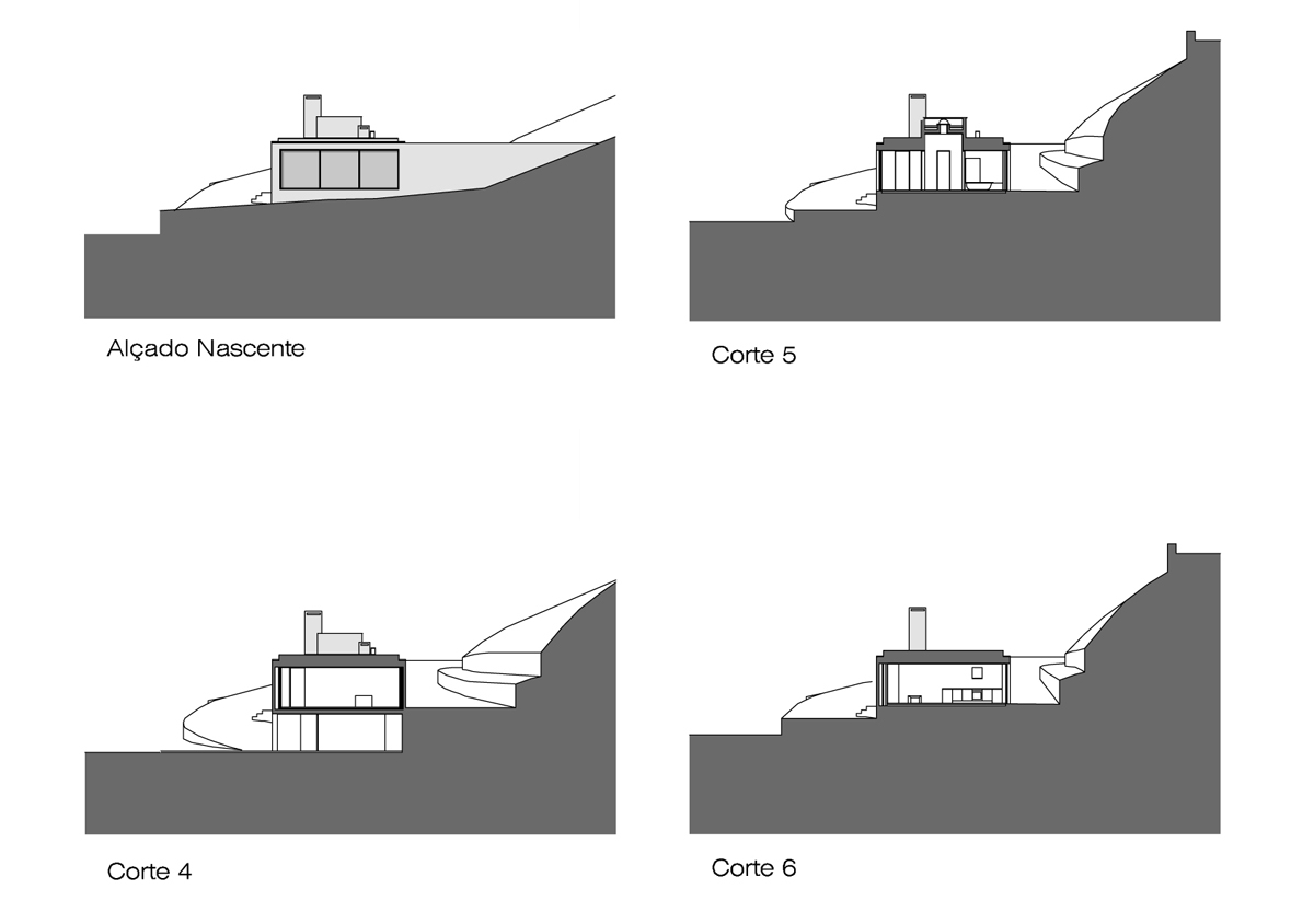
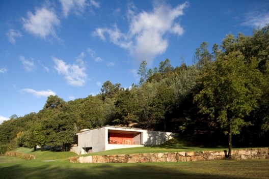
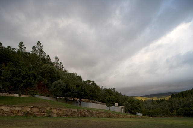
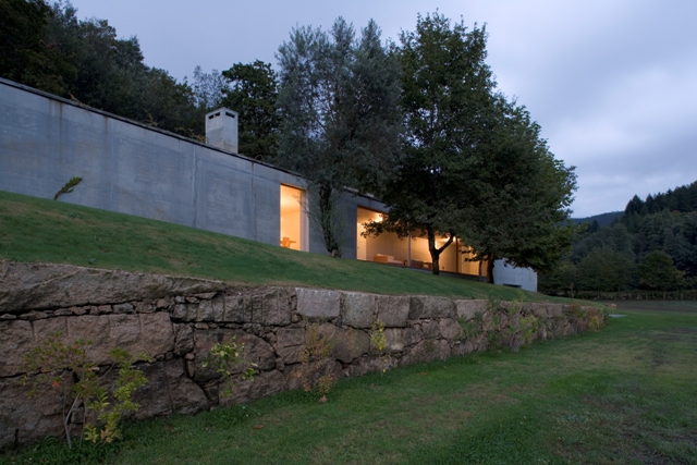
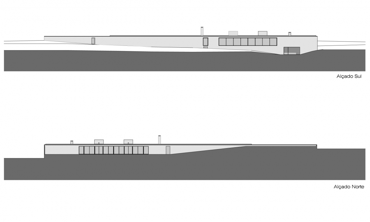
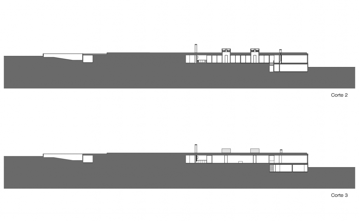
All the conception process of the Valley House starts with the Valley without the house, or either, with the confrontation of the architect with natural space. I started defining intentions. The will to respect the local topography and to take the people, through the house, to cover and to usufruct 10.000m2 of available area had been the first ones to appear. I wanted a proportionate volume in relation to the land. The idea of one lost object in the vast space did not please me, so I came up with a long and compact element embedded in the ground.
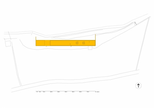
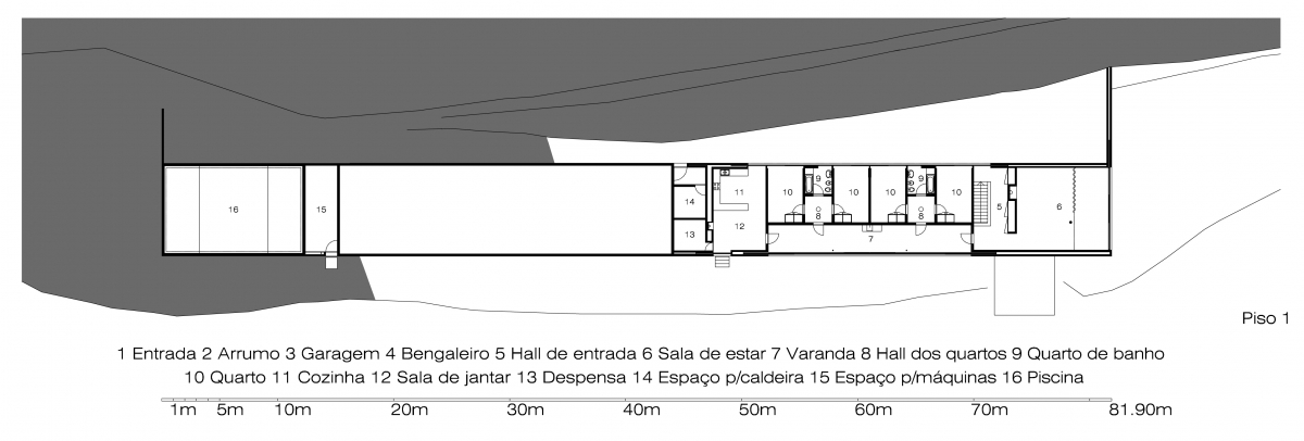
To decide the plant of the house, I recouped a traditional typology of the region. A great veranda occupies the center of the house while the remaining divisions organize themselves around it demanding its place. The simplicity and logic of the traditional typology allowed its adaptation in the time.
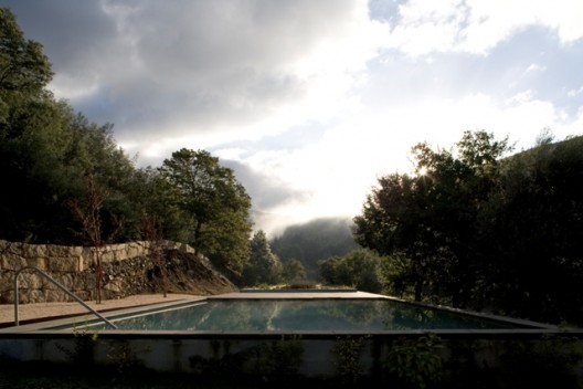
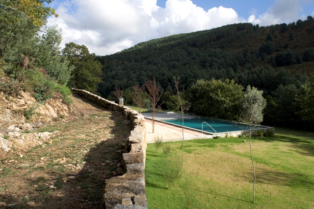
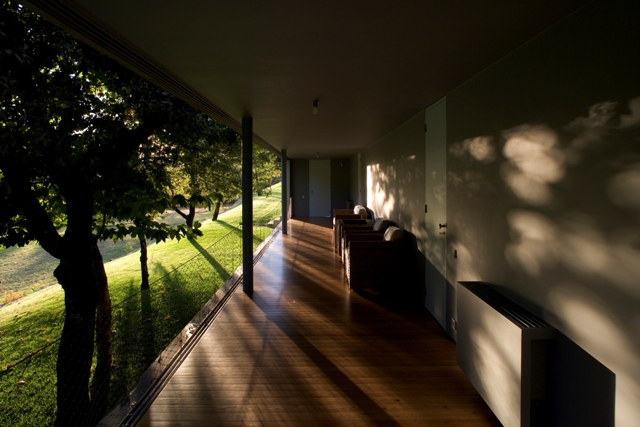
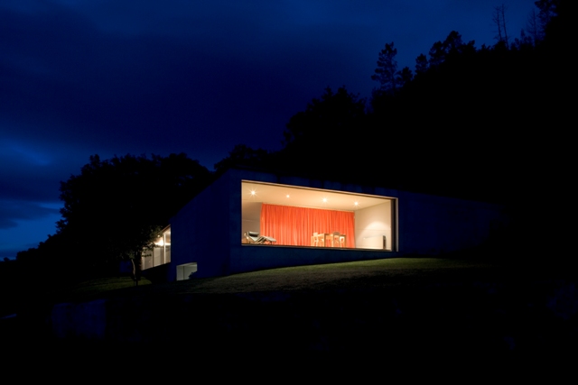
The house is directed towards the Valley and the Mountain range, the swimming pool stands in the opposite side, in the roof with its vegetal covering. I wanted a strong relation between the interior and the exterior but not a direct one, or either, there should be an ample visual contact but the physical transition from one space to the other could not be immediate for Nature in its entire splendor and the wild fauna imposed respect and even fear. Therefore, the big windows stand higher than the exterior level which transforms them into contemplation platforms. This level difference between the interior space and the exterior is enough to transmit comfort and security in days of absolute isolation.
When you enter the site you see the house hidden behind nature without any constructed way to the entrance which makes it look even more as an isolated element in space. The first impression we have, when we arrive at the plain of the Valley, does not show the true form of the house, then, as you walk through the land, you get to discover the rest of the house gradually and that provokes a surprise effect when you finally get to see it all. This ` surprise element ‘ (Montesquieu) contributes to stimulate the observer and its perception of the relation between the space and the house. The architectonic experience is made to the base of sensorial stimulations. This project looked for, the best way that it could, to explore sensations through the perception of space.
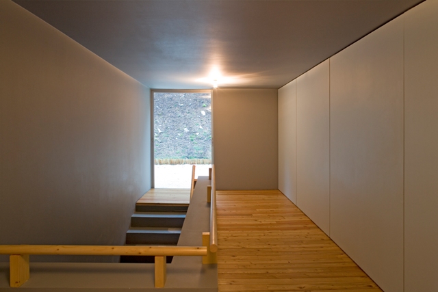
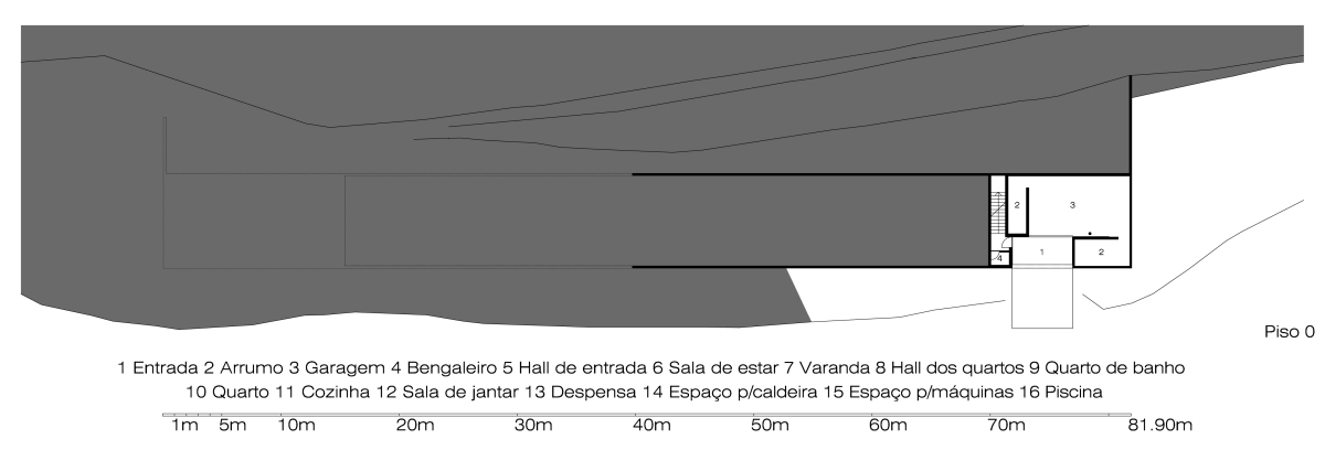
The entrance is a covered exterior space that gives access to the garage and to the interior of the house. The stairs lead to the entry hall that separates the veranda from the living room. In the living room we come across a great curtain that divides it in two distinct spaces, an introverted one, with the fireplace, and another one that opens to the exterior. This last one takes us by assault as the smashing sight of the mountain appears for the first time. In fact, the entire trip to the interior of the house is made with the mountain on your back, so you never get to see its beauty until then. Each space has a different relation with the surroundings which confers a unique identity to them. The opened veranda, protected by the trees, is a place of libation of nature, where we get lost inside ourselves.
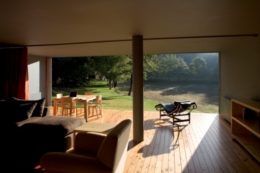
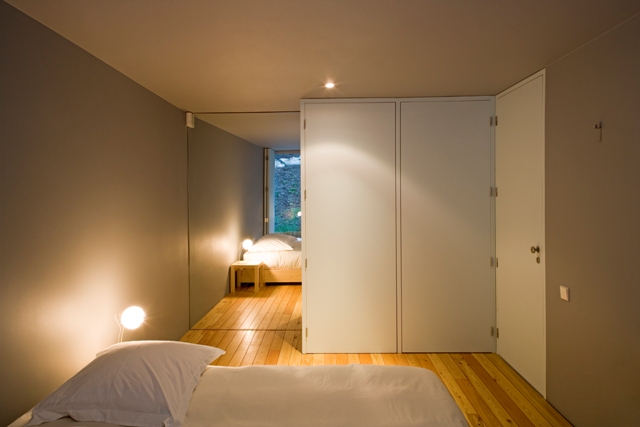
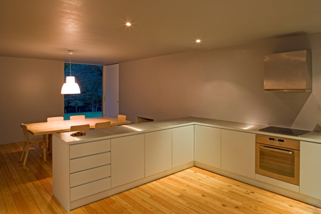
The bedroom’s area consists of two identical nucleuses with a hall, two rooms and bathroom. The rooms have access to the back garden that leads to the swimming pool. Finally, to close the corridor and in coherence with the regional tradition, the kitchen and the dinning room are in the same space. It makes sense to appreciate the meal in the place where it is made, where the complexity of the flavors flow freely to create the perfect aura.
The house is made of concrete, used as a constructive and finishing element, searching a hard materiality and contrasting aesthetics with the chromatic and textural diversity of nature that encircles it. On the inside, this contrast is emphasized through the neutral color that coat walls and ceiling and by the ‘monotonous’ way that space is designed.
Shelter was a question of survival for man, a turning point in its existence, the essential to continue. This house does not intend to be more than a shelter of body and soul. Without shelter, we are rocks in the rain.
By Nico Saieh — Via:archdialy
access plan
ground floor plan
elevations
sections 01
sections 02
