Sou Fujimoto Architects
Post By:Kitticoon Poopong
Sou Fujimoto subverts common notions of inside and out, public and private, solid and void with the N House in Japan.
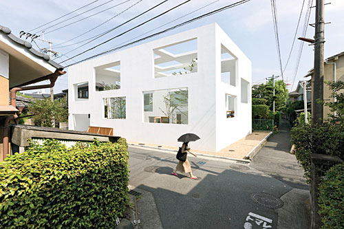
Photo © Iwan Baan
A tidy package with a porous wrapping, N House is a set of three nesting boxes that span the scales of city and domicile. Instead of sharply dividing private and public domains, the white shells contain a gradation of progressively more intimate spaces. Balancing solid surfaces and large openings, the boxes provide protection from prying eyes while promoting good neighborly relations.
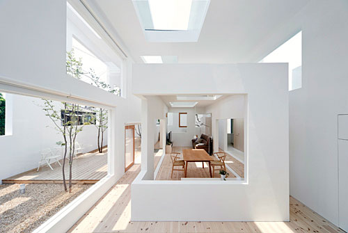
Photo © Iwan Baan
Located in a quiet residential enclave in Oita, a city of about 12,000 on Japan’s southern island Kyushu, N House was designed by the Tokyo-based architect Sou Fujimoto. The project started as the renovation of a 30-year-old home that faced a street slated for widening, and which no longer met the needs of its owners, a retired couple ready to downsize. In response, Fujimoto padded the front of the house with a layer of space and a louvered wall that would both open and close it to a garden in front. Though the clients decided to rebuild entirely, the architect held on to this idea.
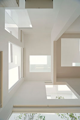
Photo © Iwan Baan
Expanding the concept to meet the project’s revised scope, Fujimoto envisioned covering the entire 2,550-square-foot site with a semipermeable shell that would incorporate exterior space and relax the rigid boundary normally drawn between house and street. “This idea confused inside and outside in a positive way,” explains Fujimoto. However, readying this ambiguous space for everyday living took a little soul-searching even for Fujimoto, whose quirky plans typically grant clients plenty of leeway to use his buildings in different ways. In deference to the pitched-roof homes nearby, Fujimoto thought fleetingly of inserting a conventional house form. But the single-story, box-in-a-box scheme won out. This strategy rooted the house in the city’s concentric organization, with webs of pedestrian passageways inside a network of narrow streets within a crosshatch of wider thoroughfares and so on. And internally, it yielded a compact but multilayered plan determined largely by the relative size and position of each box.
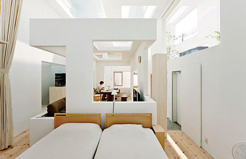
Photo © Iwan Baan
Measuring 1,895 square feet, the biggest box shelters an L-shaped yard that includes parking for two cars and a wood deck. The 635-square-foot middle box covers a donut-shaped space with the entry foyer out front, a sleeping area on one side, and a tatami-floored guest area on the other. The 195-square-foot innermost box serves as a combined living-dining room. Farthest from the street, the kitchen, toilet, and bath fill out a narrow band at the back of the largest box.

Photo © Iwan Baan
Using cardboard models, Fujimoto designed the boxes in tandem. He simultaneously considered their three-dimensional massing and the composition of their two- dimensional planes. Though legal restrictions fixed the size of the 24-foot-high outer box, Fujimoto trusted his eye to find the right proportions for the inner boxes. Decreasing their ceiling heights to 14 and then 9 feet created increasingly more humanly scaled spaces. And putting one volume inside another divided the floor area into corridors and rooms.
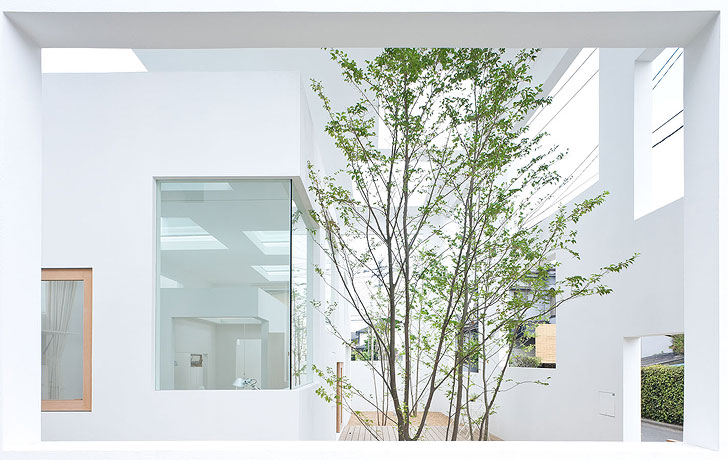
Photo © Iwan Baan
What gives N House its distinctive character, though, are the 44 rectangles cut from its three shells. Though the number of openings per envelope varies, the ratio of enclosure to exposure looks the same on every roof or wall surface. Fujimoto achieved this effect by specifying three different size openings per box, all of them golden rectangles. When it came to positioning the openings, sunshine and sight lines guided the architect. He aligned some to frame views of the sky while editing the intense Kyushu sun. Others he overlapped to reveal only oblique glimpses of the street. Within the house, where privacy was not a concern, the apertures link rooms and turn the interior into a single, loftlike space that opens to the deck and looks up toward the treetops while being shielded from overexposure in each direction.
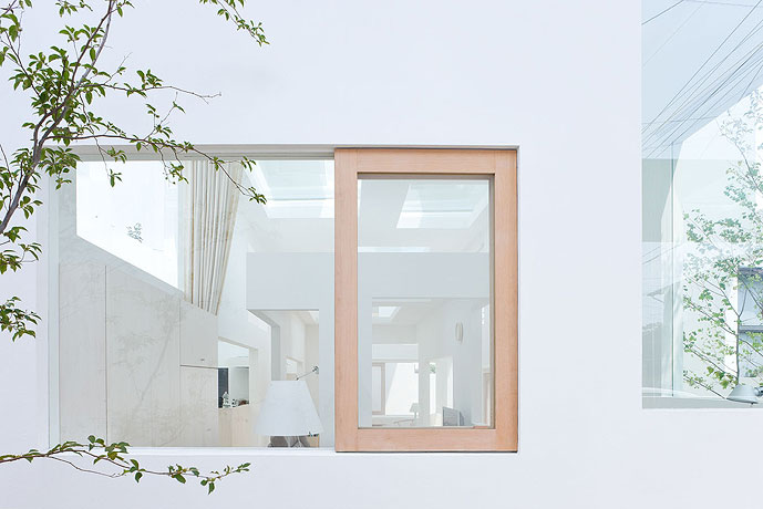
Photo © Iwan Baan
To Fujimoto, the openings are integral parts of the walls and roofs. “They’re simply empty,” he explains. Though they allow the passage of light, views, and in some places even people, they are neither doors nor windows. Only the middle box has sealed openings—3⁄4-inch-thick fixed glass sheets and wood-framed, operable windows that allow cross ventilation. And only at the most private and public places, the toilet and the two entrances from the street, did the architect provide solid doors.
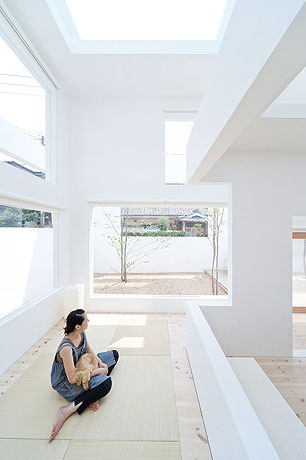
Photo © Iwan Baan
Not surprisingly, the holes complicated the structural design. While separate systems support each box—reinforced concrete for the two larger shells and a timber sandwich of wood frame and panels for the smallest—all required bolstering at weak points, such as wall bases. At the same time, Fujimoto eliminated overhead beams. And by reducing roof dimensions to match the thickness of the walls, he reinforced the house’s boxy character. Devoid of detail and coated uniformly with textured acrylic, the house’s outward appearance masks these maneuvers. “When our house was finished, some neighbors thought it was a library or public building,” says the client. The bold white box certainly has a strong presence on the street. But its large openings prevent it from being overbearing, and share the glorious views of the sky with everyone who passes by.
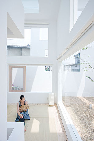
Photo © Iwan Baan
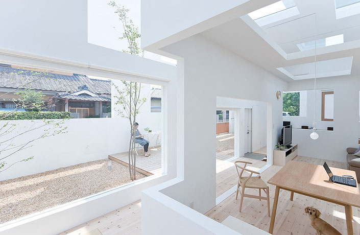
Photo © Iwan Baan

Photo © Iwan Baan
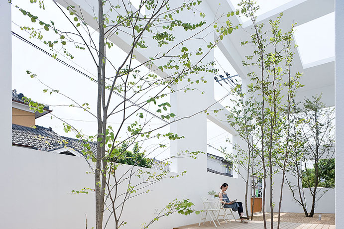
Photo © Iwan Baan
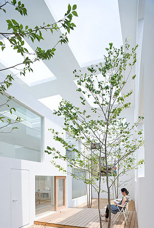
Photo © Iwan Baan
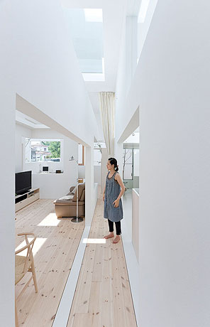
Photo © Iwan Baan
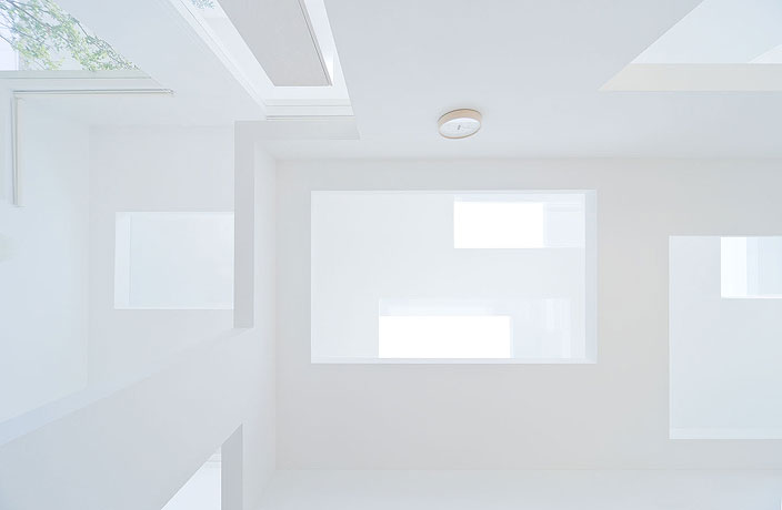
Photo © Iwan Baan
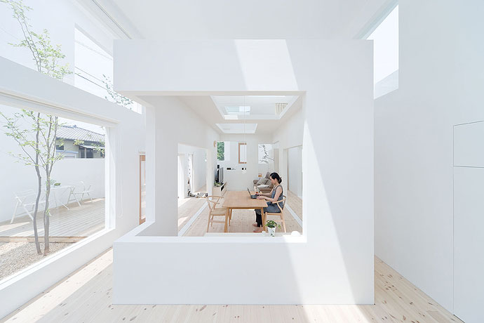
Photo © Iwan Baan
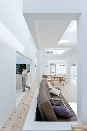
Photo © Iwan Baan
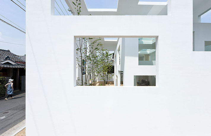
Photo © Iwan Baan
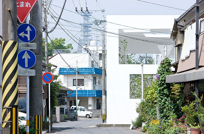
Photo © Iwan Baan
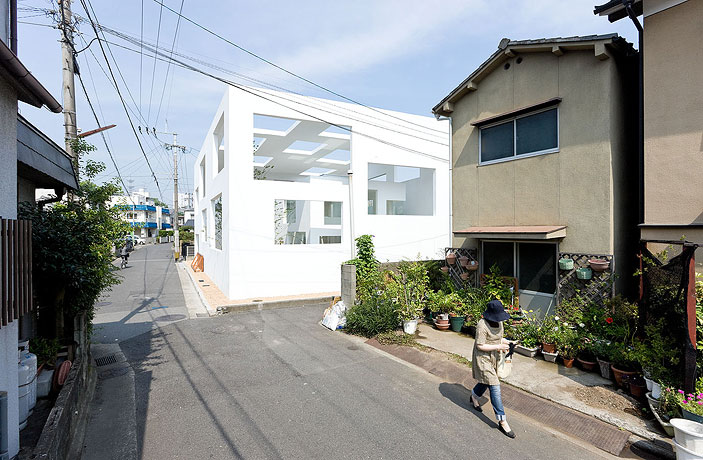
Photo © Iwan Baan
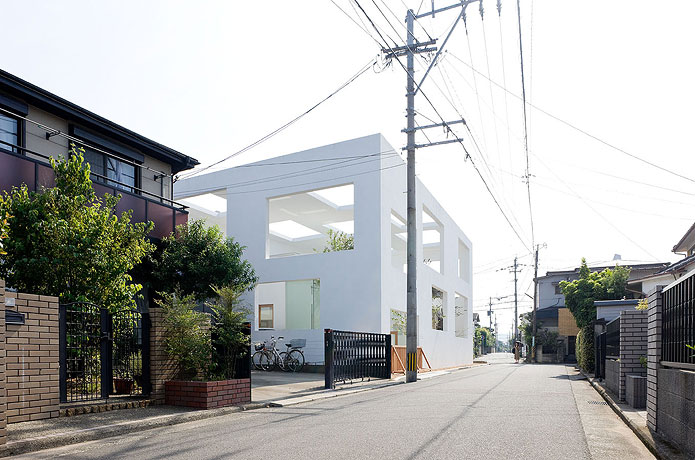
Photo © Iwan Baan
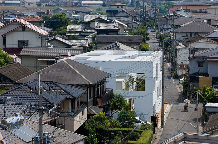
Photo © Iwan Baan
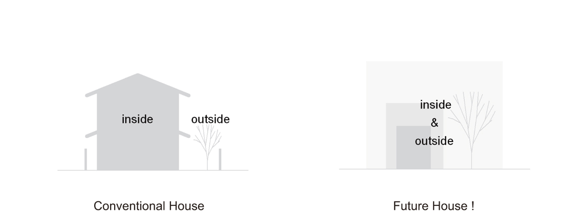 diagram
 section
 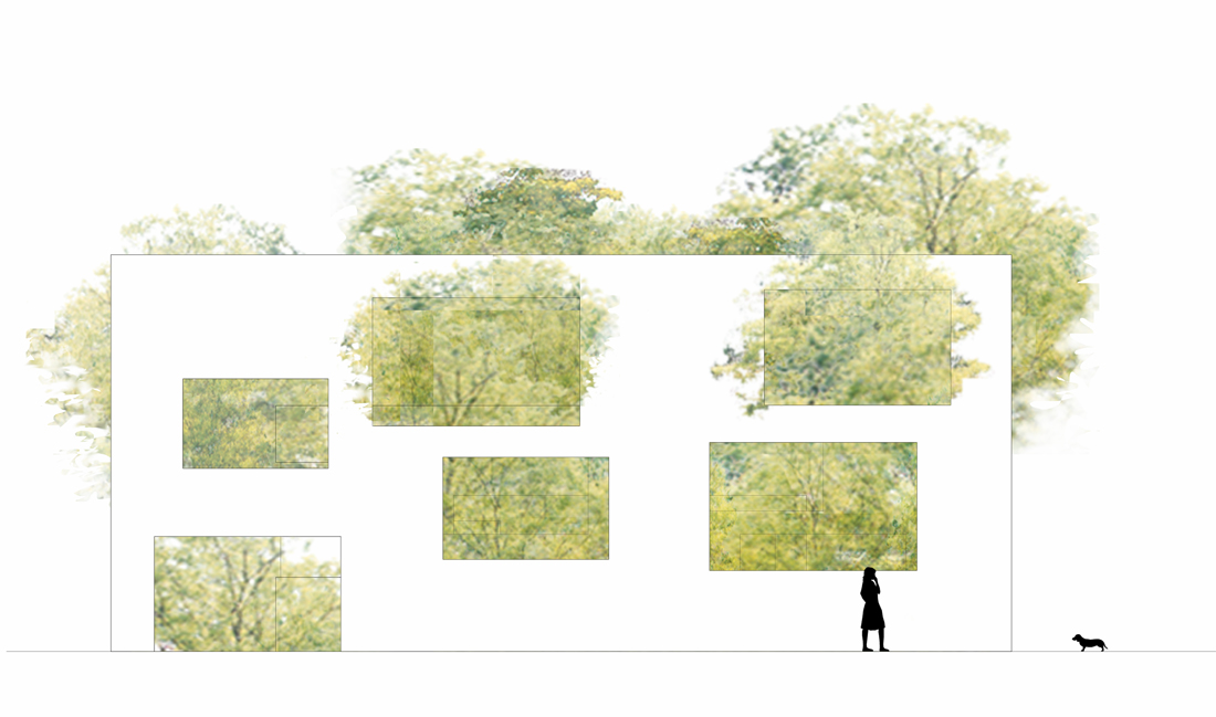 elevation
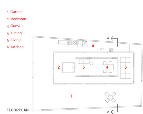
Image courtesy Sou Fujimoto Architects
via:archrecord--By Naomi R. Pollock, AIA

