Kavellaris Urban Design
Post By:Kitticoon Poopong
 |
Photo © Courtesy of Kavellaris Urban Design Click above image to view slideshow |
The subject site is nestled on a corner in the back streets of Brunswick that enjoys a northern orientation which we chose to exploit.
 |
Photo © Courtesy of Kavellaris Urban Design Click above image to view slideshow |
 |
Photo © Courtesy of Kavellaris Urban Design Click above image to view slideshow |
The aim of the project was not to re-engage and profess our manifesto on architectural and cultural regionalist issues and ideas; but mealy to demonstrate alternatives and possibilities using cost effective and generic standardised building methodologies. In this case, brick veneer, painted compressed sheet, Colorbond roofing and cladding, plasterboard etc.
 |
Photo © Courtesy of Kavellaris Urban Design Click above image to view slideshow |
 |
Photo © Courtesy of Kavellaris Urban Design Click above image to view slideshow |
Our response is an endeavour to establish an alternative architecture; another language for the average home! Another rhetoric critical of the arrangement and order of space, material, colour, scale, environmentally sustainability and urban engagement. The outcome seeks to raise questions rather than to dictate answers about the generic Australian House.
 |
| Photo © Courtesy of Kavellaris Urban Design Click above image to view slideshow |
Although the site is just over 200m2, it consists of all the programs found in a conventional sub-urban housing on a ¼ acre block; 3 bed rooms, 2 ensuites and a bath room, a study, 2 separate living zones, a court yard, a double garage and a ‘back yard’.
 |
Photo © Courtesy of Kavellaris Urban Design Click above image to view slideshow |
 |
Photo © Courtesy of Kavellaris Urban Design Click above image to view slideshow |
 |
| Photo © Courtesy of Kavellaris Urban Design Click above image to view slideshow |
The peeled back pop-up skylight sheds some light on the spatial conundrum.
Bigness competes with the compressing warped roof to negotiate access from ground to first floor.
 |
| Photo © Courtesy of Kavellaris Urban Design Click above image to view slideshow |
 |
| Photo © Courtesy of Kavellaris Urban Design Click above image to view slideshow |
The house incorporates important classical ideas as architectonic techniques instead of replicating the aesthetic by empathizing the point of entry with the converging roof ad fence lines. A double heighten entry, a dramatic staircase highlight the entry foyer.
 |
| ground + first floor plans--drawing © Courtesy of Kavellaris Urban Design Click above image to view slideshow |
 |
diagram + section--drawing © Courtesy of Kavellaris Urban Design Click above image to view slideshow |
 |
roof concept--drawing © Courtesy of Kavellaris Urban Design Click above image to view slideshow |
 |
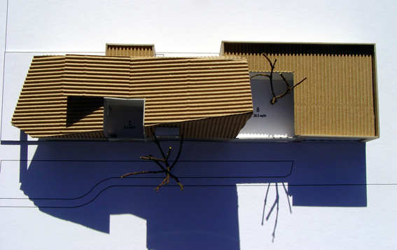
model--drawing © Courtesy of Kavellaris Urban Design Click above image to view slideshow |
 |
model--drawing © Courtesy of Kavellaris Urban Design Click above image to view slideshow |
The people
Architects: Kavellaris Urban DesignLocation: Melbourne, Australia
Project area: 200 sqm
Photographs: Courtesy of Kavellaris Urban Design
Note>>Location in this map, It could indicate city/country but not exact address.