Powerhouse Company
Post By:Kitticoon Poopong
Powerhouse Company fits a futuristic glass gem into the Dutch landscape with Villa 1.
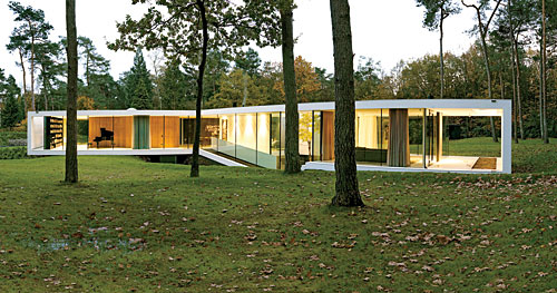
Photo © Christian Schaulin
In a densely inhabited country like the Netherlands, it is not easy to find a secluded spot for a private residence. But that was just what a client was looking for when he commissioned a new home in the town of Ede from Powerhouse Company, the young firm of Nanne de Ru and Charles Bessard, based in both Rotterdam and Copenhagen. The house, which was the firm’s first project, is called, appropriately, Villa 1.

Photo © Christian Schaulin
Secluded though it may be, it has certainly not gone unnoticed. It received the AM NAi Prize of the Netherlands Architecture Institute for architects under 40, the Dutch Design Award for its interior, and was nominated for the European Union Prize for Contemporary Architecture Mies van der Rohe Award. And indeed, even though it is sequestered away in the woods, how could a building like this remain anonymous? It has a swoopy Pussy Galore-meets-Mies quality that is “super-cool.” At the same time, it is crafted with such attention to material and detail that it is utterly tactile. 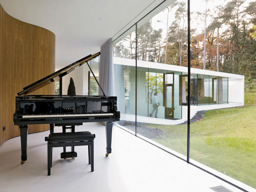
Photo © Christian Schaulin
The design was inspired by a small drawing created by the client when he was a young boy—a few straight blue lines sketched on yellowed paper. “When I was thirteen, I made this sketch of the house that I would build someday,” he says. “Now I have it.”
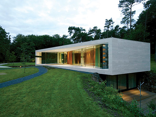
Photo © Christian Schaulin
The architecture was also influenced by the site, which had a small weekend house on it at the time it was purchased. Local zoning stipulated that any new building be no larger than the existing structure, which was about 2,153 square feet. The municipality, however, was willing to overlook the space below grade and allow a basement. So the architects were able to more than double the size of the new house to about 5,167 square feet divided over two levels—one subterranean, the other airy and at grade, with curved glass walls, which seems to hover just above the ground. All the columns but one are hidden from sight, reinforcing the sense of a floating, transparent volume.
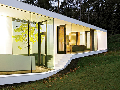
Photo © Christian Schaulin
The travertine-clad steel structure extends out to about 16 feet beyond the glass curtain wall that surrounds the interior. Wrapping around the kitchen above the garage, it is intersected by a horizontal, slitlike window so that from the inside, occupants can always enjoy the view to the southwest. “Everything—the shape and the overhang of the roof, the positioning of the building—was determined by the orientation to the sun,” says de Ru. “It allows generous light in the winter and shades the rooms in the summer in order to keep the house from overheating.”
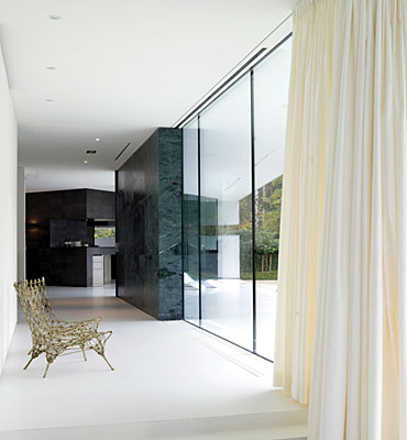
Photo © Christian Schaulin
This relationship to daylight resulted in the unique plan of the house, roughly the shape of a Y with a short stem. On the ground floor, the study faces north, the living room faces south, and the kitchen (at the base of the Y’s stem) gets light from the east, west, and south. These “wings” meet at the heart of the house, the combined entrance hall and dining room with a dining table and a fireplace. The wing to the left has a large studio at its far end. Here the roof and the outer wall extend past the glass box, forming a partially enclosed terrace punctuated by a narrow reflecting pool under an open skylight.
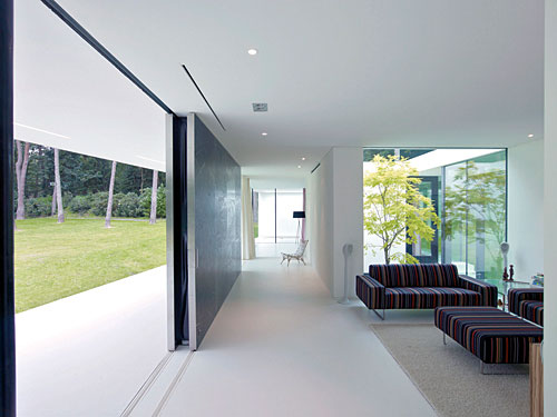
Photo © Jeroen Musch
Separated from the studio by a small patio, the living (aka family) room seems to be the most enclosed space in the house—that is, until what looks like a stationary green marble wall slides soundlessly open to the terrace beyond. Lighter than it appears, the massive double-layer sliding door, measuring about 13 feet long by 9 feet high, is made out of aluminum honeycomb panels covered with a .08-inch-thick stone veneer from Pakistan. Stone veneer reappears in the kitchen, where the walls are covered in a rare Norwegian slate with granite flecks.
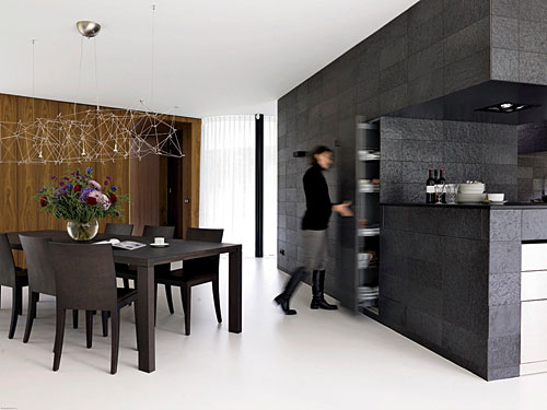
Photo © Christian Schaulin
In the study wing opposite, an ingenious undulating wood structure covered in American walnut (veneer again, and obtained from one single tree) organizes closets, a small bathroom, a fold-down guest bed, a niche for a small desk, and the hidden entrance to the stairway down to the bedrooms. Here, too, the roof and the outer wall extend past the glass box. But, as there are no columns on this side of the house, the glass wall required stabilization. To remedy this without compromising the pure aesthetic of the design, the architects devised a structural-steel bookcase weighing about 10,482 pounds, thoughtfully configured so that there is just enough space behind the bookcase to be able to clean the glass wall.

Photo © Christian Schaulin
Below grade—the private area of the home—the master suite opens out onto a generous, split-level deck equipped with a spa tub. Two guest bedrooms and baths in the opposite wing receive daylight from the sunken patio between the living room and studio upstairs. Adjacent to both, a long hallway features approximately 66 feet of continuous built-in storage. Finally, at the far end of the lower level, the garage is a high-tech tour de force sheathed in corrugated-aluminum wall panels fitted with vertical fluorescent tubes, with a ceiling of shimmering, quivering plastic foil overhead.

Photo © Jeroen Musch
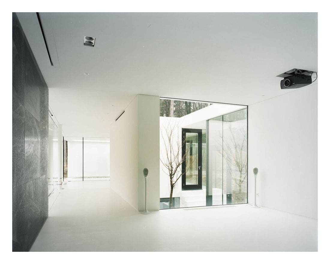
Photo © Powerhouse Company
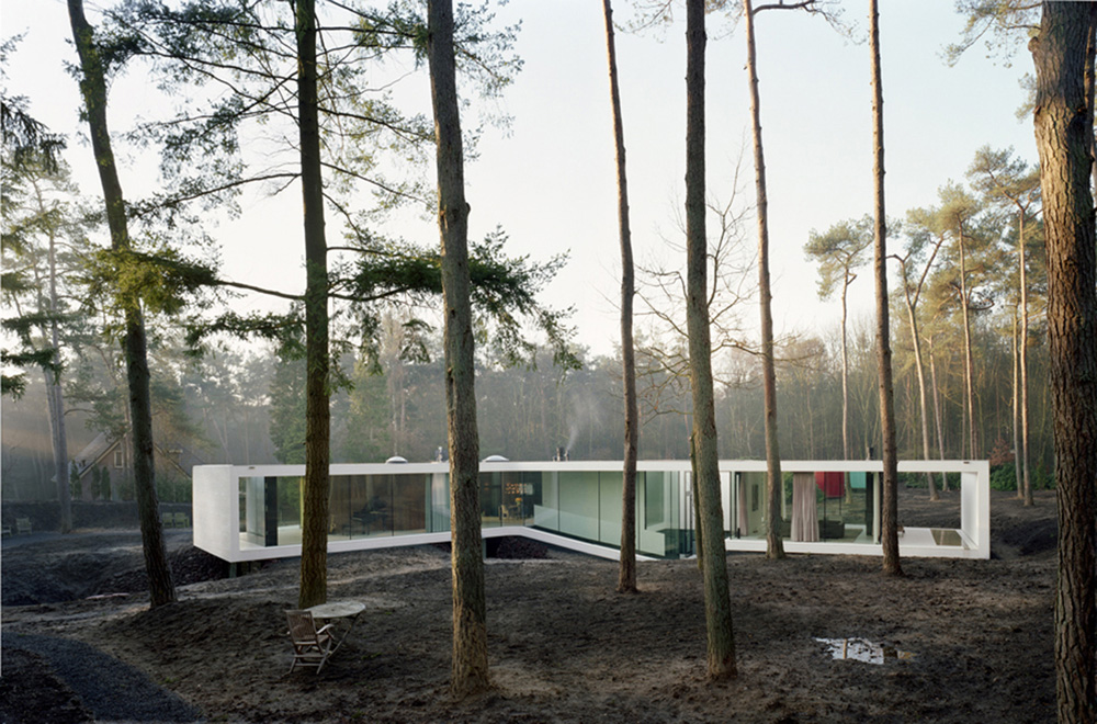
Photo © Powerhouse Company
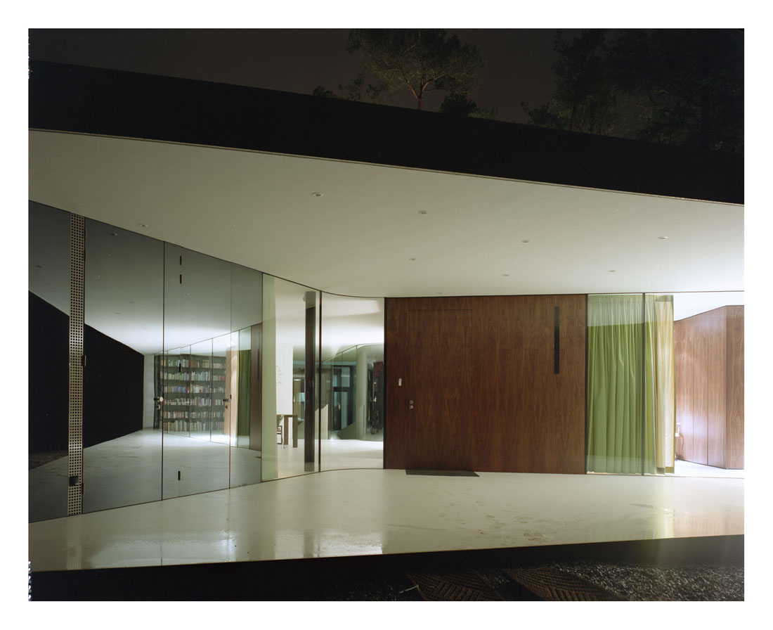
Photo © Powerhouse Company
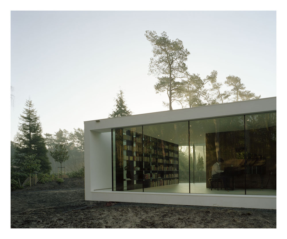
Photo © Powerhouse Company
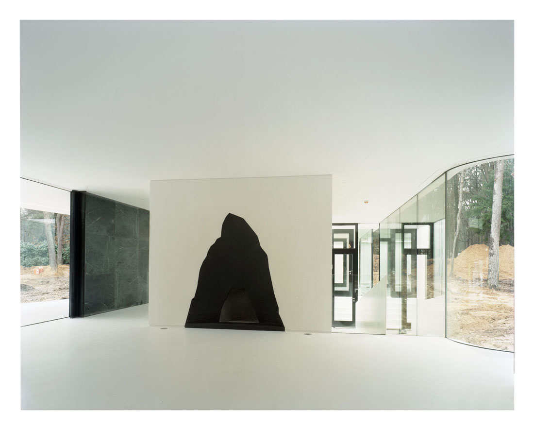
Photo © Powerhouse Company
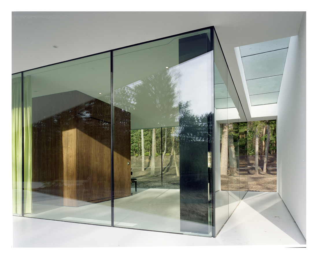 Photo © Powerhouse Company
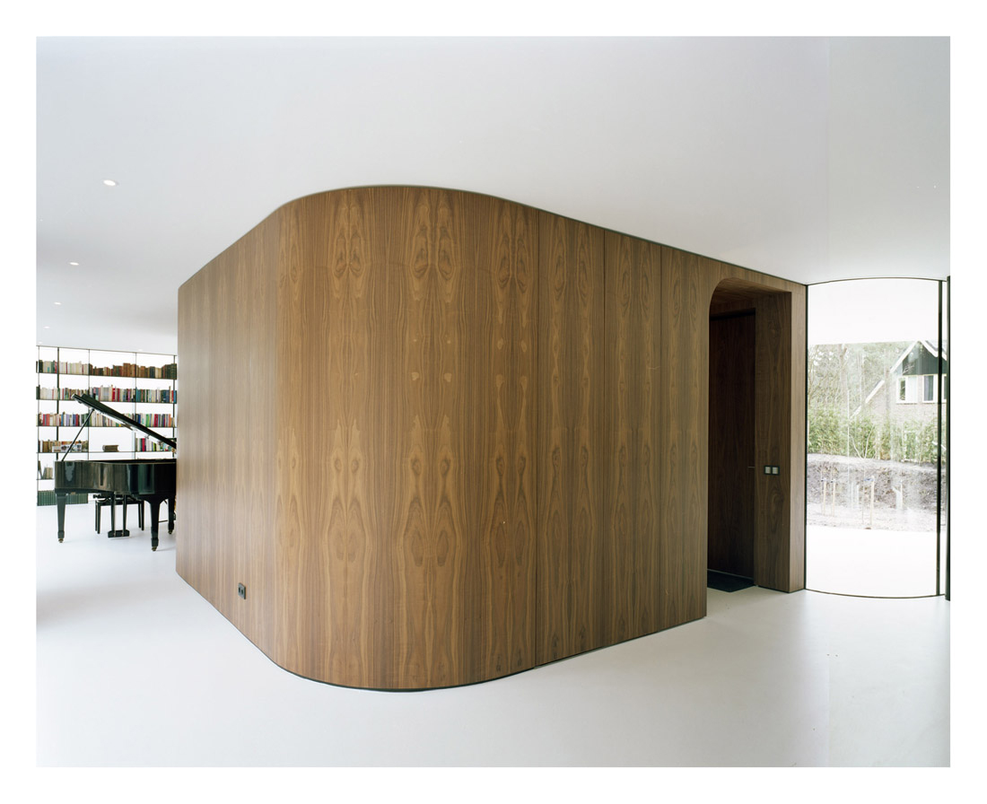
Photo © Powerhouse Company
Its jazzy looks, luxurious materials, and fine details are in themselves enough to make this house stand out. But it is not just about superlative style and comfortable appointments. What makes this house truly noteworthy is the symbiosis between form and function, the way the aesthetic springs from design rigor and the conditions of the site. This is modernity for a new millennium.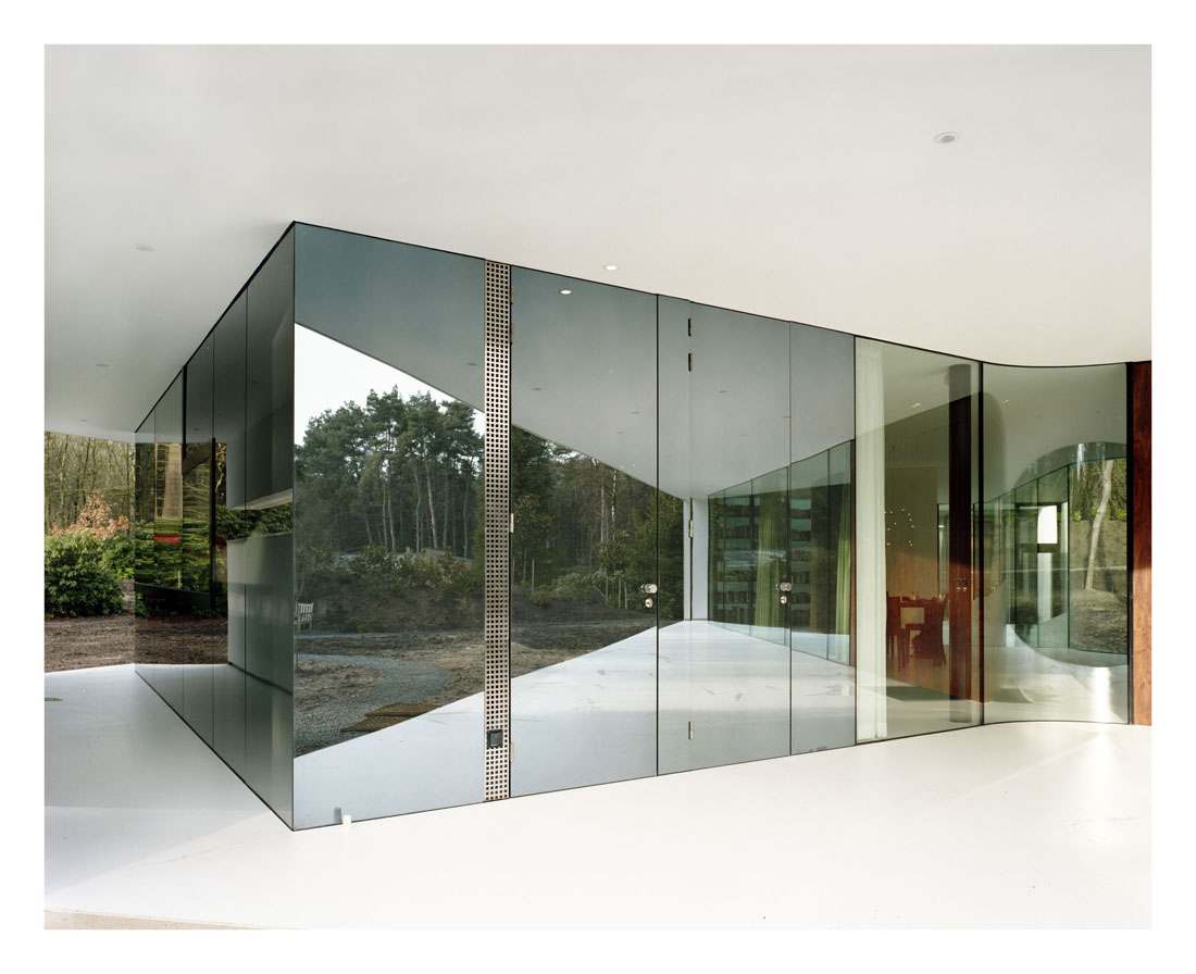
Photo © Powerhouse Company
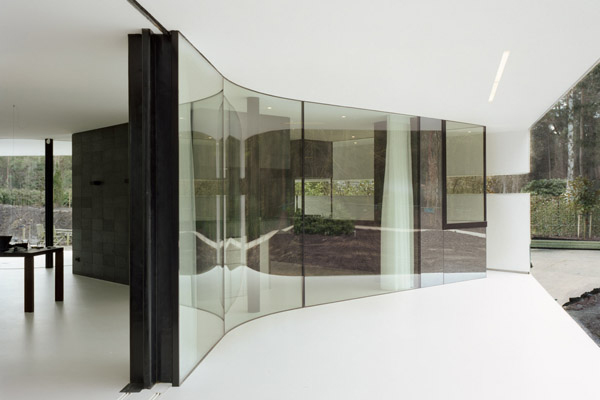
Photo © Powerhouse Company
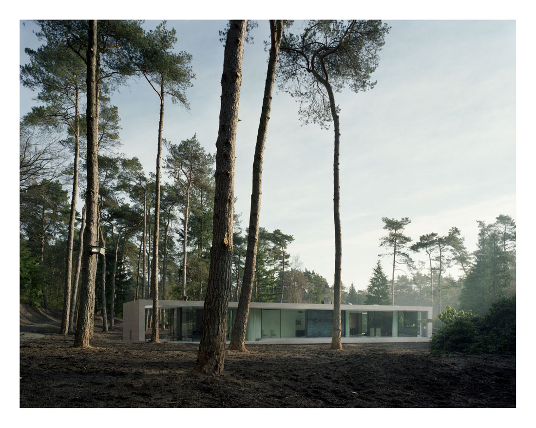
Photo © Powerhouse Company

Image courtesy Powerhouse Company

Image courtesy Powerhouse Company

Image courtesy Powerhouse Company

Image courtesy Powerhouse Company
via:archrecord--By Tracy Metz

